
In this video, we walk through the CommCare Data Pipeline—a new way to move the data your frontline workers collect into the systems your organization already uses.
Most programs already have their...

This is a recording from the DHIS2 Annual Conference 2026. DHIS2 has strong built-in analytics, but also works well together with external analytics platforms when additional functionality is neede...
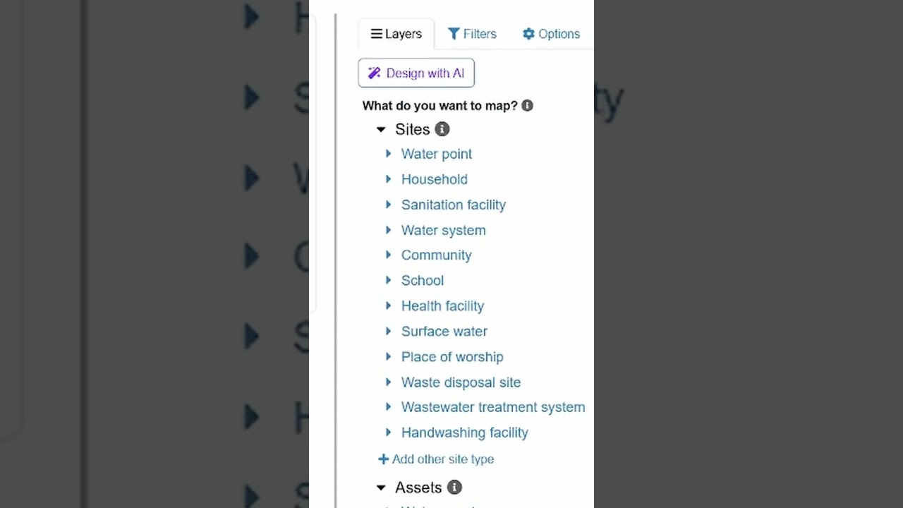
Now you can visualize your water and WASH data just by talking to AI in mWater. Try it out: https://portal.mwater.co
Datos que Transforman: Periodismo e Investigación en Acción

📊✨ Descubre cómo los datos abiertos impulsan el desarrollo y la investigación.
El BCIE te invita al webinario “Datos que Transforman: Periodismo e Investigación en Acción”, donde los finalistas de..
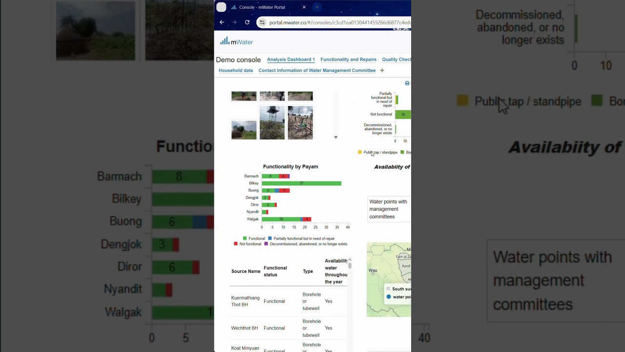
Try out dark mode in your #mWater dashboards with a click of a button.
#datavisualization #sdg6 #tutorial

📝 noyb has filed a #GDPR complaint against #LinkedIn! Why? The #Microsoft subsidiary tracks the visits to profile pages. However, if you want to see who has visited your own profile, you have to ..
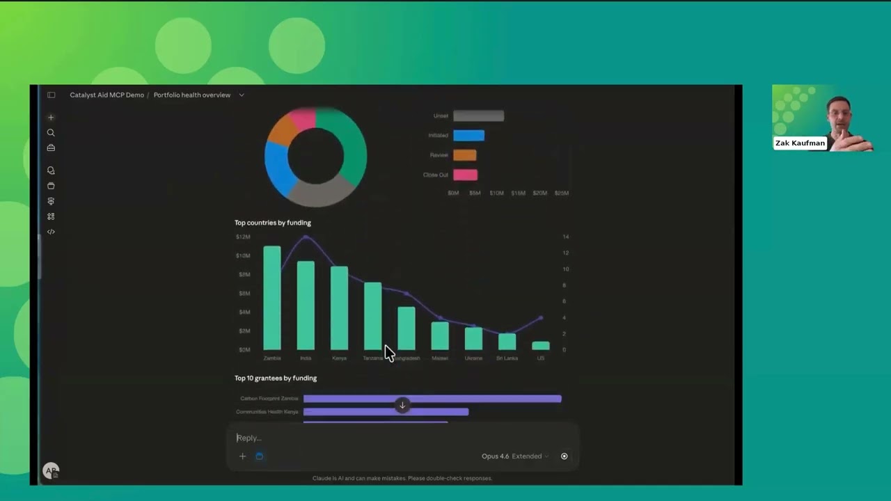
In this session, we take the Claude Skills feature a step further by connecting it directly to Salesforce and Amp Impact through a custom MCP (Model Context Protocol) connector. This setup allows C...
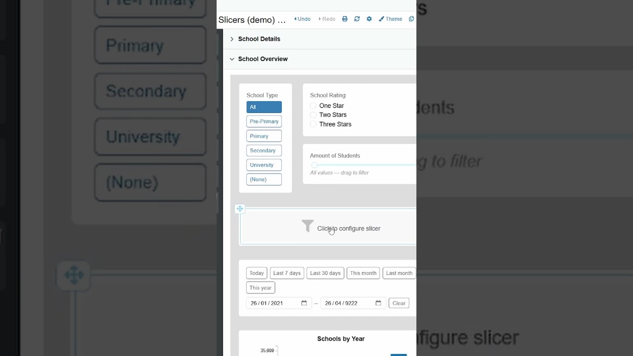
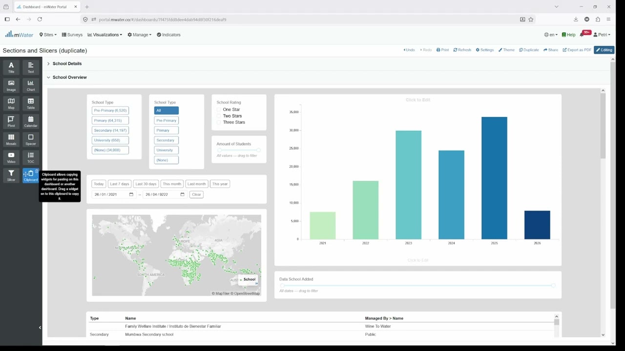
Learn how to make your dashboard more interactive with slicer widgets.
You can allow users to interact with your data by filtering choice fields, custom options, numerical ranges or dates.
#mWat...

We’re excited to share a video tutorial on the DHIS2 Dashboard Usage Metrics App, recently approved and published on the DHIS2 App Hub.
In this guide, we walk you through how the app works and how...

Every feature available in the UI — code-to-code mapping, phrase-to-code search, boolean queries, domain filtering, and value set activation — is accessible via REST API, and this video walks throu...
Panel de la Red de Observatorios Laborales: datos para el análisis del mercado laboral en Brasil
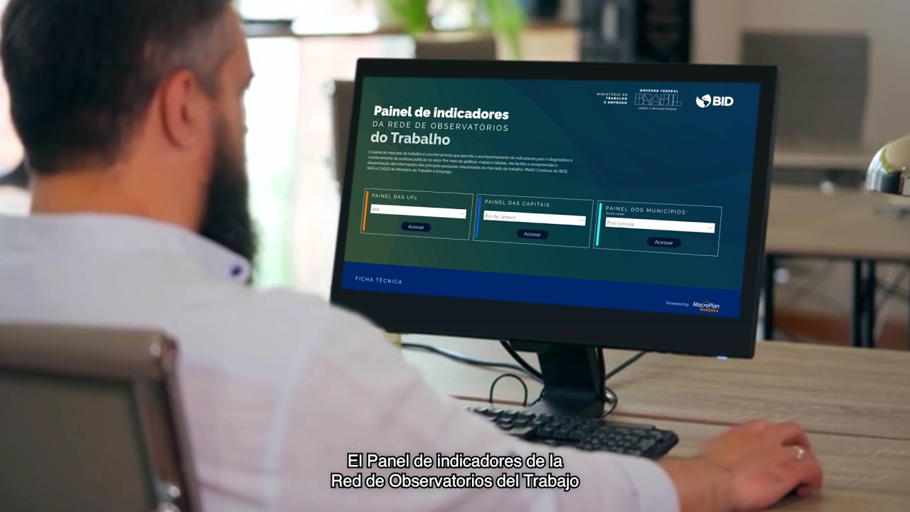
...cómo los datos pueden impulsar las decisiones de política pública: https://app.powerbi.com/view?r=eyJrIjoiYTQ3ZDM0YzgtYmExYi00MTkzLTg2MTgtMmY0NDU3NTlmNGJiIiwidCI6IjNl...
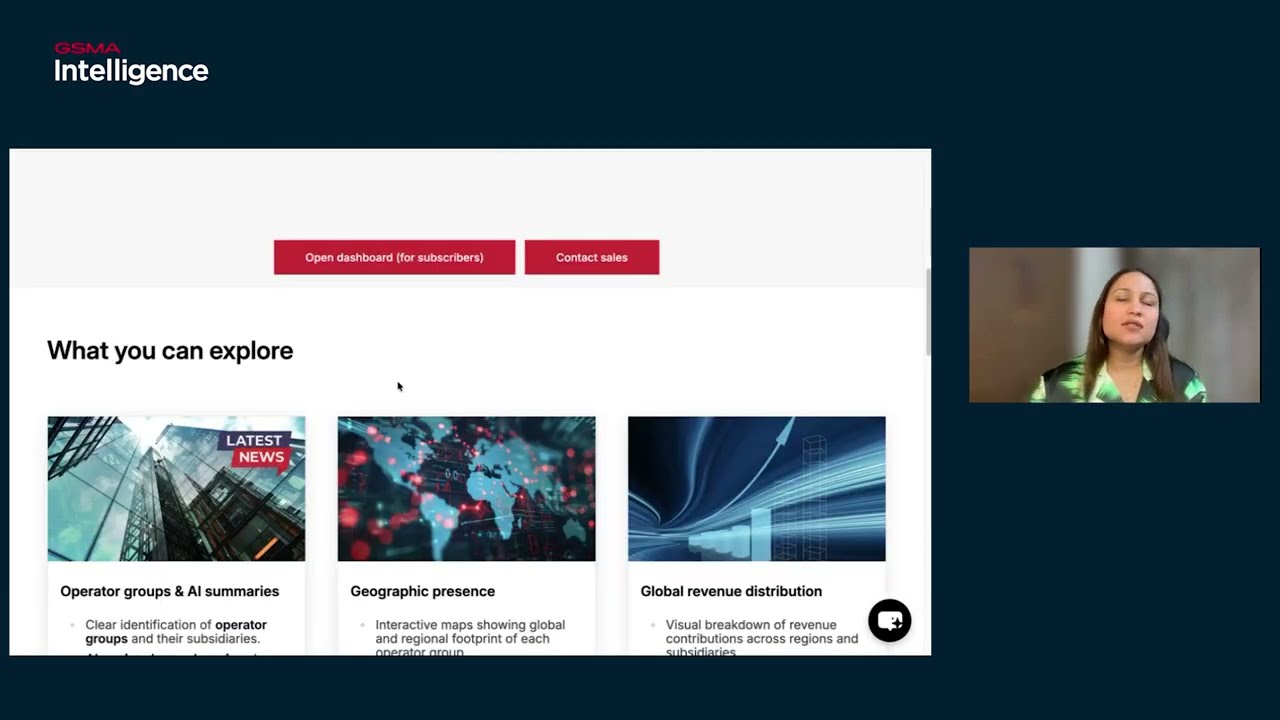
GSMA Intelligence introduced its all-new Premium Data Suite in 2026, designed to give telecom professionals a faster, smarter, and more visual way to navigate the global telecom landscape.
Radhika ...


... Dashboard and discover how data can drive public policy decisions: https://app.powerbi.com/view?r=eyJrIjoiYTQ3ZDM0YzgtYmExYi00MTkzLTg2MTgtMmY0NDU3NTlmNGJiIiwidCI6IjNl...

Durant cette session, vous allez explorer comment analyser efficacement ses données, créer des graphiques, cartes et tableaux de bord clairs, et transformer ainsi les chiffres en décisions éclairée...

To use AI in healthcare safely and effectively, we need more than just tools. We need the right skills.
WHO/Europe’s Data, Artificial Intelligence and Digital Health unit holds a special training ...
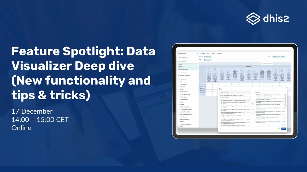
In this webinar, we will highlight recent functionality in the Data Visualizer app, showcasing new and improved ways to explore, analyze, and present your data:
- Data item definitions
- Option...
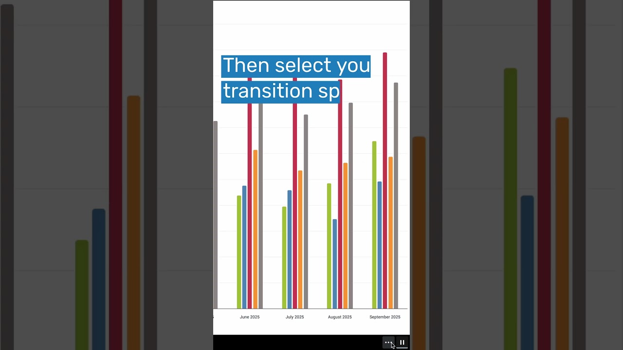
The new DHIS2 Dashboard app autoplay feature means your dashboards can now rotate automatically—perfect for live screens, control rooms and briefing displays.
Set it once, sit back and let the in...
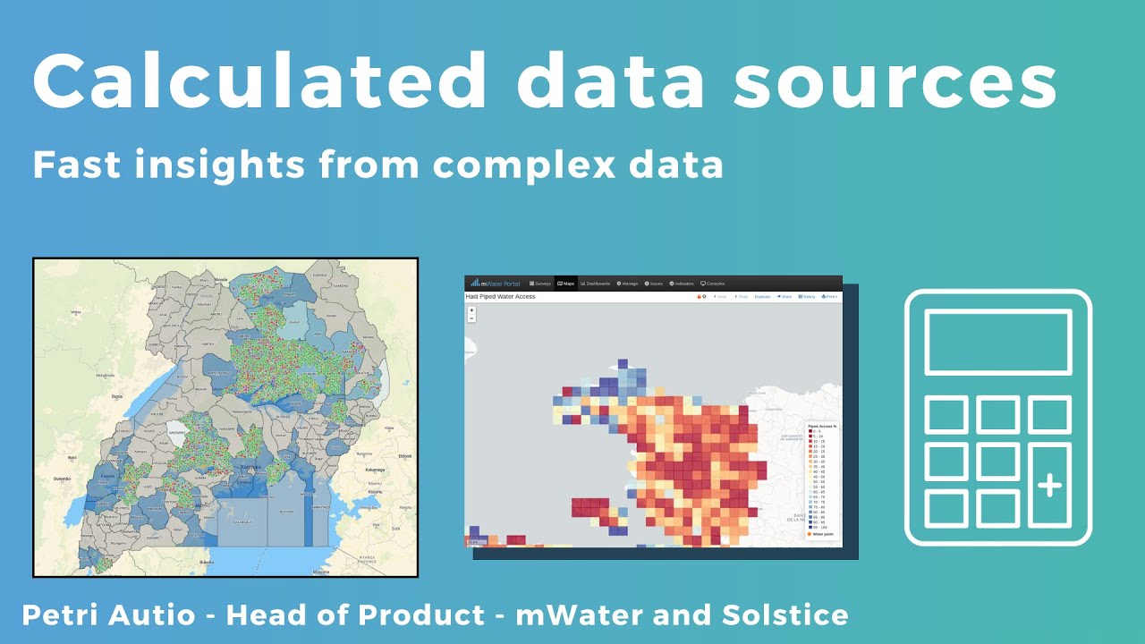
...solstice.world/#/resource_center/calculated_data_sources
#mwater #SDGs #ict4d #powerbi #datmanagement #qgis #Governance