
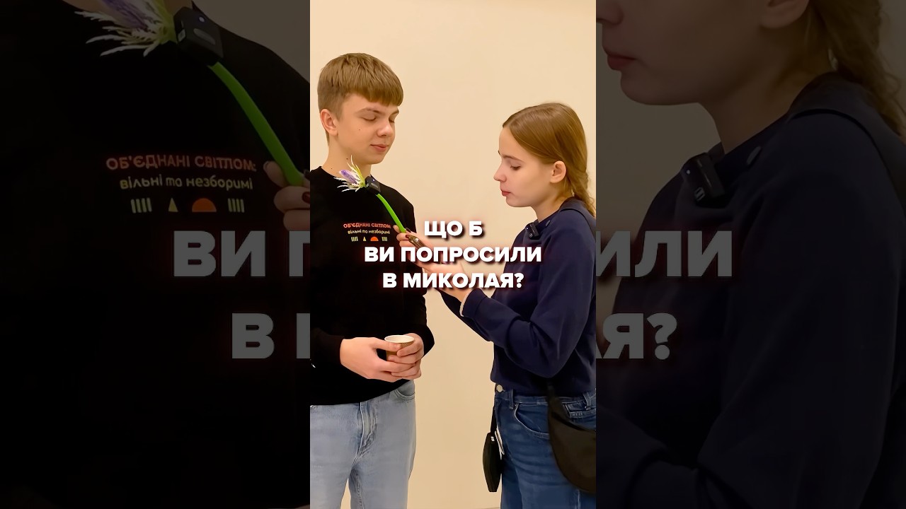
How to Make User-centric Maps? | Insights from Global Mapping Experts | Episode 2

Explore what goes into making user-centric maps and information systems, from persona creation to governance and more.
Maps - like public transport - are a part of every journey and city, making m...
Why Are Maps Important? | Insights from Global Mapping Experts | Episode 1
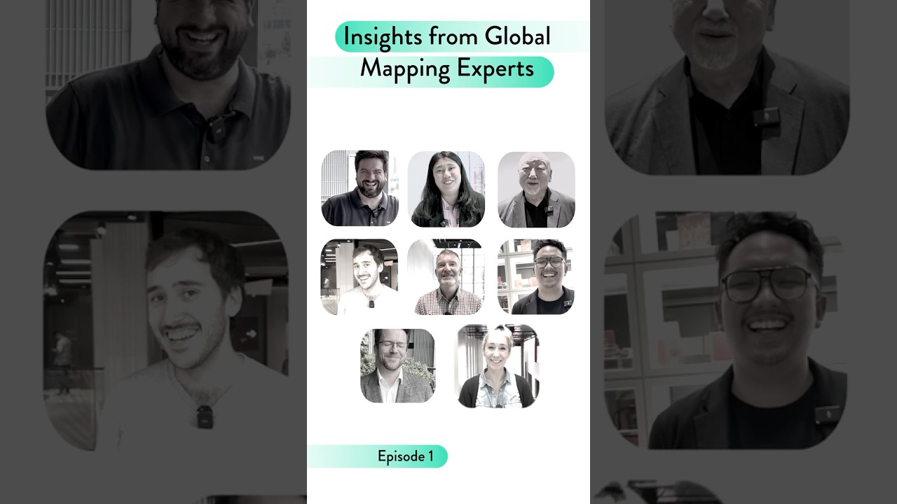
Explore what makes aesthetic, integrated, and inclusive maps so important from global public transport professionals working in mapping.
Maps - like public transport - are a part of every journey ...
Applied Atlas: Maps to Inform Hypertension Management in Your Community

In this video, we will walk through examples of how you can use the Atlas to improve hypertension management in your communities.
This video can also be viewed at
https://www.cdc.gov/wcms/video/lo...
Overview of the Atlas of Heart Disease and Stroke

The Atlas is a free online tool that allows you to easily access high-quality, local-level data and maps. With these maps, you can identify and document geographic differences and address community...

피드를 내리던 당신,
춥지는 않으신가요?🥶
플랜이 여러분을 위해
세상에서 가장 따뜻한 핫팩을 준비했어요❤️🔥
지금 바로 🔗아래 링크에서
마음까지 따뜻한 겨울을 보내보세요💙
🔗 https://bit.ly/3NxpqGP
#플랜코리아 #플랜 #핫팩
Why Africa Looks Different on Different Maps
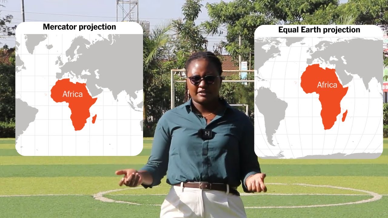
...is video explains how map projections and coordinate systems change the way the world is drawn and why the Mercator projection, used in most maps today, makes countries n...
... America (Tundra)
56:25 South America (Coastline & Jungle)
58:50 Human Era (Worldwide)
01:03:03 Give Well Integration
01:04:10 Space Outro
The power of storymaps
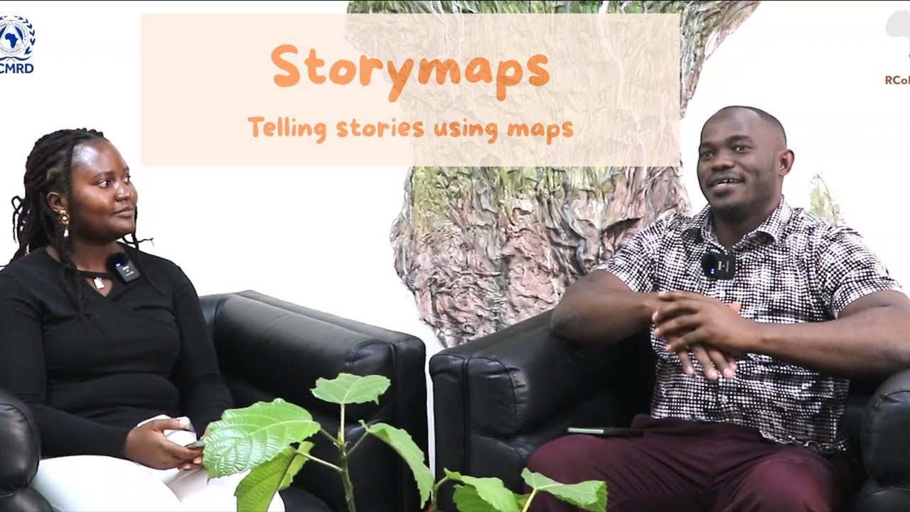
Discover how StoryMaps transforms ordinary information into immersive, visual narratives. In this episode, we explore how you can combine maps, multimedia, and storytelling to communicate ideas mor...
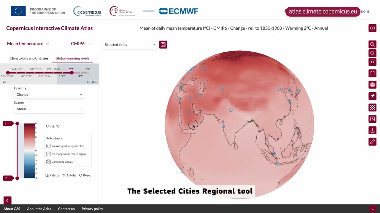
The Copernicus Interactive Climate Atlas released by the Copernicus Climate Change Service C3S is a powerful and intuitive interactive tool to explore the past of our climate and the key projection...
...t shifts.
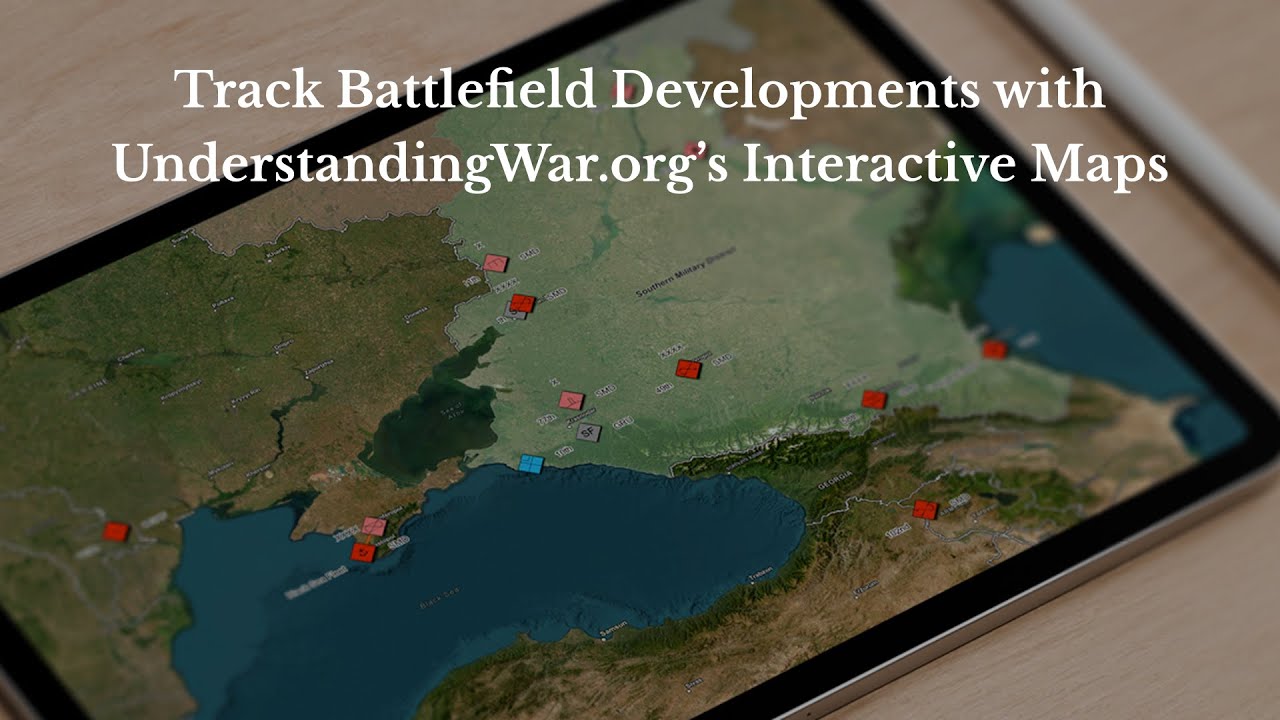
Our redesigned map experience makes it easier to find and view ISW’s world-class maps. In ISW’s new Map Room, you can now view territorial changes over time th...
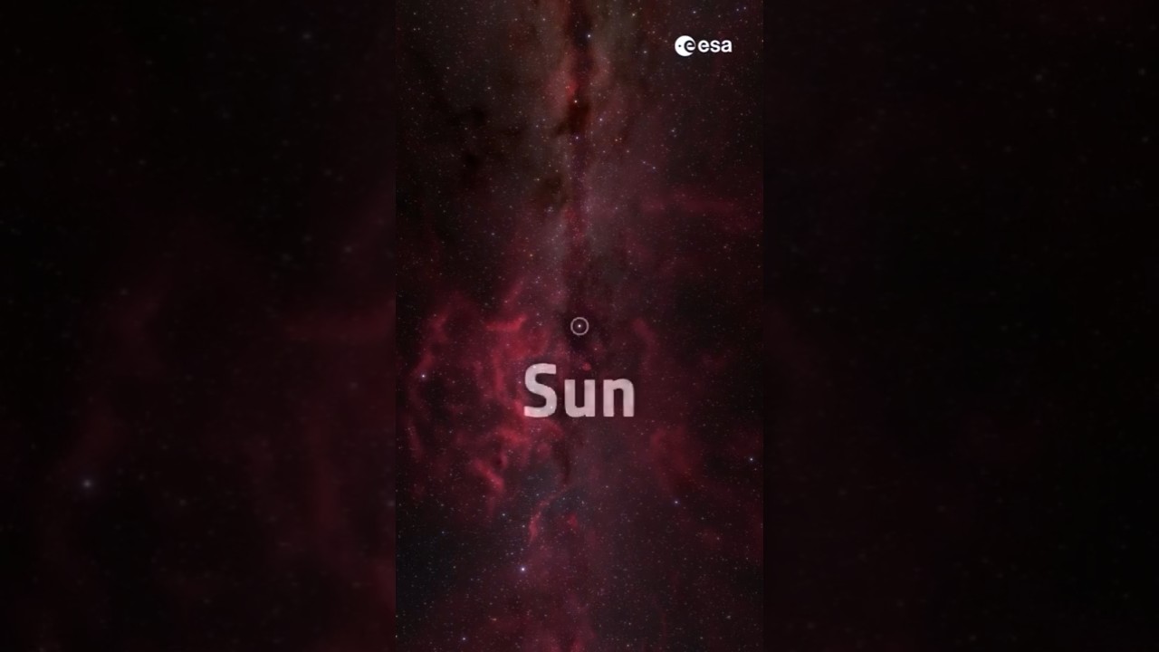
This map is based on Gaia’s observations of 44 million ordinary stars and 87 O-type stars. (O-type stars are rare starts, they are young, massive and extremely bright and hot.)
These star-forming ...

Our product specialist Guillermina walks you through how to create, customize, and publish a symbol map in Datawrapper with customized tooltips, text annotations, size and color legend, and more.
...
Join Crazy Town's Rob Dietz on a Google Earth tour of the phenomenon known as "Mar de Plastico" in southern Spain.